2026-03-27: Challenges with Ancient Dates in Apple SDKs
Apple provides a set of tools for working with dates in our apps. Foundation provides the primitive types, calendar operations, and localized formatters, and both macOS and iOS provide UI components for viewing calendars and picking dates and times. They are well-built, usable, and cover typical app needs very well. But there are limits.
TimeStory is often used by people to capture historical and even prehistorical dates. Importantly, it needs to do a lot of date computation, not just holding Date values and mapping them to and from localized strings. Depending on what you’re doing, with ancient enough dates, the Apple SDK ranges from incomplete to nonfunctional. And some of those limits only became obvious after trial and error. Every one of the rough edges below has come up during feature development or in the form of a customer bug report.
The 4713 BC lower limit in Foundation
Foundation’s date-handling code has an effective lower bound around January 1, 4713 BC on the Julian calendar. You can create a Date value representing an instant in time below that limit, but many Calendar methods will return unexpected values when you try to do anything with it. For example:
// Tested on Swift 6.3 as shipped in Xcode 26.4
import Foundation

let cal = Calendar(identifier: .gregorian)
let fiveThousandBC = cal.date(from: DateComponents(era: 0, year: 5000))!
print(fiveThousandBC.formatted(.dateTime.year()))
    // -> correctly prints "5000"

let oneYearLater = cal.date(byAdding: .year, value: 1, to: fiveThousandBC)!
print(oneYearLater.formatted(.dateTime.year()))
    // -> incorrectly prints "4712"!
Many other attempts to work with date components or perform date arithmetic will fail, sometimes in inconsistent ways. The specific details vary, and have changed over Foundation’s evolution, but this has been true for a while. (I discovered this during the early days of TimeStory because a timeline’s layout would be completely wrong when you scrolled that far to the left. It obviously needs to do date computations to place gridlines and map out the X axis.)
It’s worth stating the obvious here: in nearly every case, when talking about events six thousand years ago, they’re going to be approximate years at best, not precise calendar dates. But the example code above only deals in years, and something as simple as adding one year gives the wrong answer. If you want to write code that can handle both modern dates and ancient years, you need to implement a cutoff beyond which your code no longer uses the Date or DateComponents types.
January 1, 4713 may seem like an arbitrary date, but it is significant in many computer date math systems. It’s day 0 in the Julian day number system, a way of mapping any historical calendar date to a single integer, with a number of known algorithms around it. (That link goes to Peter Meyer’s site, full of interesting stuff about calendars and date math, if you’re into that.)
The 1 AD lower limit in UIDatePicker
AppKit gives us NSDatePicker, UIKit gives us UIDatePicker, and SwiftUI just wraps up whichever of those applies. They’re solid components, and you should use them, as the design matrix underlying a date picker is massive: localized calendars, user calendar preferences, UI language, type size, accessibility, and more. And NSDatePicker does okay with BC dates.
UIDatePicker, however, simply cuts off at AD 1. (Although it’s showing you dates on the Julian calendar by that point, Julius himself is completely out of reach!) There is no workaround for this other than writing your own replacement calendar picker, which I just said you should not do. (But if you do, it is incredibly instructive.)
Limitations in Era Formatting
When formatting or parsing dates, there is no way to override the built-in era symbols (like “BC” and “AD”) or, in locales where multiple conventions are in use, to choose among them. While other date symbols, like weekday and month names, tend to have firmly-established formats and abbreviations, eras, which we don’t use every day, vary a bit more.
For example, the English language has two conventions for eras. “BC” and “BCE” mean the same thing, and “AD” and “CE” mean the same thing, and different people and communities choose one or the other. BC and AD are traditional, while BCE and CE avoid their religious associations. But in the US English locale, BC and AD are all you get, and all that will parse.
(Also, traditionally, English puts the era symbols in different places: “100 BC” vs. “AD 100”. This is totally unsupported by DateFormatter, but I’d argue less of an issue, as modern usage often writes “100 AD”.)
In other languages, I’ve heard from customers that the built-in formats are not ideal. In French, for example, for BC, DateFormatter will only use or recognize the syntax “av. J.-C.”, with that punctuation and spacing. This is inconvenient to type. There’s no way to tweak DateFormatter to allow variations or alternate forms, or even to parse ignoring punctuation.
The only workaround is app code getting involved in parsing and formatting date strings, a challenging proposition in an app that supports multiple localizations.
The Fixed Gregorian Transition
The Gregorian calendar is the common 12-month solar calendar. It was a corrected replacement for the much older Julian calendar, which looked basically the same but had leap years a bit too often, causing a given day like January 1 to slowly drift later and later in the seasons.
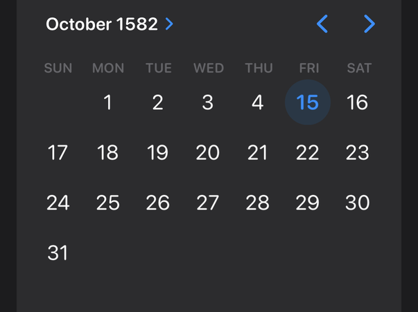
The new calendar was designed by the Catholic Church, and Pope Gregory XIII declared it to be in effect in 1582 on the day that the old calendar called October 5 but the new calendar now called October 15, skipping ten day numbers to make up for that drift.
Foundation.Calendar(identifier: .gregorian) follows this rule unconditionally:
// Tested on Swift 6.3 as shipped in Xcode 26.4
import Foundation
let cal = Calendar(identifier: .gregorian)

let lastJulianDate = cal.date(from: DateComponents(year: 1582, month: 10, day: 4))!
print(cal.component(.day, from: lastJulianDate)) // prints 4

let firstGregorianDate = cal.date(byAdding: .day, value: 1, to: lastJulianDate)!
print(cal.component(.day, from: firstGregorianDate)) // prints 15
And here’s how it looks in a date picker control, taken in the Reminders app, which thankfully lets us set timed reminders for centuries ago:
But many places adopted the Gregorian calendar later, sometimes much later. Non-Roman-Catholic countries were in no hurry to follow the Roman Pope’s instructions. For example, the British Empire officially adopted it almost two centuries later, in 1752; if you look at English-language historical records around that time, you’ll often see the terms “N.S.” (New Style) and “O.S.” (Old Style) attached to dates to make it clear which calendar was used.
It would be nice if I could allow users to configure the transition date, and have all DateComponents conversions follow it, but Foundation offers no such public API, so app code must make appropriate adjustments.
(For going to and from strings, the older DateFormatter type does have such a property defined, but it wasn’t carried forward into the newer Date.FormatStyle API, and it obviously doesn’t affect DateComponents conversions.)
2025-12-30: Chasing WWDC
Every June, during WWDC, Apple announces their big OS updates, and every fall, those OSes ship. There’s always something pitched to app developers to adopt or adapt to, it’s all kept as secretive as Apple can manage until it’s revealed to us, and we then have the opportunity to chase some or all of it for day-one releases with the OS in roughly three months.
Especially for an indie, choosing to chase features from WWDC can be a big deal, pushing aside our own product goals or customer requests for Apple-driven work. We’ll need to download the betas and ride out any early bugs, figure out how to maintain (or whether to drop) older OS support in our codebases, and work with in-flux SDKs. In exchange, we hope to improve our apps, keep current with the evolving look and feel of the OSes, and be part of the flurry of press, App Store features, and social media buzz when the OSes do land.
I’ve chased “dubdub”, to some extent, three times (that I can think of now) during TimeStory’s six years of development, including this year we’re at the end of, and have some reflections.
The Big Sur UI refresh (WWDC 2020)
Big Sur changed the basic window design in a way that made non-updated apps immediately stand out, and I liked the overall look of the new unified toolbar. (I do still miss the old standard of rich, irregular macOS app icons that Big Sur moved us away from, but in my case, my old icon was pretty rough, so it was easy for me to move forward to the new style.)
The work was relatively straightforward and easy to conditionalize by OS, and I shipped it in time for day one. I was happy with the result and it left me in good shape for future updates.
Shortcuts in Monterey (WWDC 2021)
MacOS Monterey added the Shortcuts app and corresponding Intents framework from iOS to the Mac. I was excited to add easy end-user automation to my app. I particularly hoped to be able to respond to feature requests with “you can do that today, with this shortcut”. I quickly prototyped it with help from a great WWDC lab session, posted a public beta, emailed a few people in the press who covered app automation, submitted to Apple for an App Store feature well ahead of time, and shipped in time for day one. (Original dev blog post.)
Results?
- No press or App Store coverage. Not too surprising; many less-niche apps built great Shortcuts support at the same time.
- The feature is genuinely useful. I’ve used it myself, built several useful examples, and have in fact offered shortcut-based solutions to customer emails. But it’s much less of a selling point than some customer-requested timelining features that I might have done instead.
- No measurable bump in sales compared to any other app update.
And, frustratingly, the very next year, Apple announced App Intents, a completely new framework for exposing Shortcuts actions. It’s much more pleasant to work with as a developer, and has since then been extended to integrate better with other OS features like Spotlight. And it immediately rendered my implementation legacy code. Rather than maintain parallel old and new implementations, I just let the old code sit. (In 2025 I finally dropped Monterey support, and can start migrating over.)
I often wish I’d waited on this feature. I like it, but I don’t think the ROI was there, and it was really only appealing to a limited set of my users.
xOS 26 UI updates (WWDC 2025)
Fast forward to this year. WWDC25 included a ton of new UI stuff, including the much-discussed Liquid Glass; some of it I liked, some of it less so. What pushed me over the edge in deciding to chase at least some of it was installing the first beta of macOS Tahoe. It was clear that non-updated apps would immediately stand out, from the radius of the window corners to the look of standard controls, and I wanted to make sure my apps looked well-maintained. I decided on a major (dot-zero) release number to give me a bit more license to update the UI than normal, and dug in.
My personal favorite WWDC25 announcements, by far, were the adoption of Mac-ish menu bars and overlapping windows on iPadOS 26. I use productivity apps on my iPad Pro, in addition to writing one, and these have been long-needed. They were both relatively easy to adopt, as well, both being built on existing SDKs from iOS 18 and before, only needing more polishing, testing, and in the case of the menu bar, auditing and filling in missing items. On its own this was an unreserved win.
I also liked the idea, for canvas-style apps, of moving a few carefully-chosen controls out into floating glass layers over the document canvas. Apple’s benchmark here is Freeform. On Mac, I already had a similar pattern for a scroll control (using traditional blur visual effects rather than the new glass effect), and I now applied it to time scale and document zoom, two things that to me make the most sense floating at the bottom of the window.
This, unfortunately, turned into a surprising time sink. There was a lot of churn, with each macOS beta changing at least something about how glass effects looked or behaved. Different control types applied glass effects inconsistently (and still do, in the released versions). When presented over a white background, glass layers become hard to spot without additional tweaking. This resulted in many hours of experimenting and iterating, far more than the size of these controls would imply. I’m pleased with the final result, but expect to keep revising it over time.
One thing Apple pushed for, which I did not adopt, was to extend blurred document content up under the toolbar. I tried, over many hours, repeating with each new beta, but it never worked out. Timelines are often colorful, text-heavy documents, and frankly the app looked awful when the wrong strip of the timeline would scroll under the toolbar. (App developers have very little control over this; we just extend the content up, and Apple’s code applies the blur and glass effects.)
There’s more to this story, but this blog post wasn’t meant to be a technical deep dive. (I also want to note that we took on other work, including some substantial new user guide authoring, at the same time; the 4.0 release cycle wasn’t just chasing WWDC, unlike the prior two examples.)
The main result here is that the release took me so long to develop that we ran into some previously-planned travel. We were able to work during that incredible trip, but not every day (Hemi wrote about it on her blog), and the final release wasn’t out until December. I’m happy with many of the UI updates we made, and happy to have gotten past this to unlock future development, so I can’t really say I wish I’d waited. But still, the cost-benefit ratio was pretty high, and the non-Apple-driven feature content I shipped in the second half of 2025 was a fraction of what I’d planned at its start.
2024-02-13: iPad Dev Notes: Touch, Mouse, and Pencil
This is the second post in my TimeStory for iPad Dev Notes series. The first post was many months ago, and called “Dev Journal”. Well, the app’s nearly done, and I didn’t end up journaling as I worked, but I did take notes which I still want to write up, so “Dev Notes” it is.
An iPad app can get “touch” input three ways: from direct touches on the screen, from an Apple Pencil, and from a pointer driven by an external mouse or trackpad. These each behave differently, but are all delivered by the system as touch events.
App code often doesn’t care. A button is pressed, some text is selected, or a scroll view is panned, and it doesn’t matter how. But when building custom gestures, or a direct drag-and-drop canvas like TimeStory’s main timeline view, these differences often matter very much. Here are a few of the things I learned during development.
(The code-level notes all deal with UIKit; while I do use SwiftUI to construct most of the rest of my app’s UI, the main timeline view and its gesture recognizer code is all UIKit.)
Dealing with touch precision
Any form of custom hit testing needs to be aware of how precise and accurate each touch actually is. For example, Apple Pencil can be treated almost like a Mac mouse cursor. The user can easily hit small targets and perform precise drags. Direct touch, on the other hand, is both imprecise (the touch has a rather large radius around its center) and inaccurate (neither that center point, nor that radius, are exact). Pointer actions sit in between; the iPadOS pointer is a touch-like disk, not a Mac-like arrow.
The key is to read UITouch.majorRadius (for touch precision) and .majorRadiusTolerance (for touch accuracy) and use them to test a radius around the center of the tap or drag or other gesture, rather than just testing that center point. This can result in multiple hits if targets are close to each other; it may be as simple as choosing the closest to the center, but sometimes an app will have specific targets (like a draggable resize handle) which should take precedence over more general ones (like the image to which the handle is attached). I iterated on this part of the code several times; it was useful having testers with different preferences (touch, Pencil, mouse) and different types of documents.
Showing the right kind of menu
Per Apple’s guidelines, we should show edit menus in the horizontal style when tapping with a finger and in the vertical style when right-clicking with a mouse. I initially just directly presented my (horizontal) edit menu (via presentEditMenu(with:)) from the tap gesture callback, but that same callback happens on left click. This meant that mouse users got them in both styles: horizontal from left click, vertical from right click! The fix was just to inspect UITouch.type first.
Getting UITouch info from gesture recognizers
Unfortunately, UIGestureRecognizer and its subclasses don’t expose the underlying UITouch objects when delivering gesture events. The easiest way to capture this information is by implementing gestureRecognizer(_:shouldReceive:) in the delegate and saving the radius and type values from the incoming UITouch objects.
Ensuring Scribble works
Scribble is the feature of iPadOS which lets you handwrite into any text input area with your Apple Pencil. (I love this feature.) Normally, there’s nothing you have to do to support it; it just works.
In my case, however, I support editing event titles directly in the timeline. This places an editable UITextView with a transparent background right on top of my scrolling, draggable document view. When I first tried Scribble there, the Pencil’s movement would pan the scroll view or drag the underlying event, making the whole thing unusable.
Fortunately, this is easy to fix. UIScribbleInteractionDelegate offers callbacks when writing starts and ends; use them to disable and re-enable the appropriate gestures.
Distinguishing pans from drags
Unlike a Mac, an iPad uses exactly the same gesture for panning a scroll view as for dragging an object within that scroll view: you slide your finger across the screen. I found that it could be frustrating when the interaction between the two were not clear.
I decided to only allow dragging of a selected object; if you want to drag something without selecting it first, a long-press will select it and start the drag together. I then told the scroll view’s pan gesture recognizer to not start until my own drag recognizer failed (via require(toFail:)).
(This is one of many areas where I often went back to Keynote as my favorite benchmark app. Zoom in on a slide in Keynote, then drag your finger across an object; it scrolls if the object isn’t selected, and drags if it is. It’s always nice to have good benchmark apps.)
Taking advantage of double taps on the Apple Pencil (2nd generation)
The Apple Pencil (2nd generation) is the one with wireless charging and magnetic attachment. It has the ability to detect when you tap twice on the side of it; this interaction was designed to quickly switch tools within a drawing app or similar context.
My app has a variety of editing tools, arranged as a strip of buttons in the center of the toolbar. I made double-tapping the pencil cycle through them, left to right (with “no tool” being the N+1th state). Combined with Scribble, this makes it possible to do quite a lot of timeline editing without using anything but the pencil.
(Unfortunately, Apple excluded this feature from the newer and cheaper USB-C model, creatively named “Apple Pencil (USB-C)”. I don’t know if this was purely for cost savings or if they’ve decided to phase the feature out; I hope it’s the former!)
2023-09-08: AppKit notes: Customizing text view drawing
I just implemented a small customization to text-view drawing which I thought was pretty neat. I thought I’d walk through it, describing some of the steps to customize text drawing in AppKit and TextKit 1, for anyone thinking about doing something similar in their own code.
My app lets you type into an unbordered, transparent text view, over a background whose colors can vary. The code previously tried to pick the one best-contrasting text color, but due to a bug report I finally bit the bullet and made it adapt within the view as you type:

To apply colors to character ranges, you just need to configure your view’s attributed string content. But I wanted to apply colors to rectangular regions, even when those regions split a single glyph; this requires customizing the text drawing code.
NSTextView is the main text view class in AppKit. In TextKit 1, the
classic text system, it uses NSTextContainer to define the geometry
of its available text space and NSLayoutManager to lay out and draw
glyphs into that space. Customizing text drawing therefore starts with
subclassing NSLayoutManager and installing our custom instance by calling
replaceLayoutManager(_:) on our text view’s text container.
Note: Apple introduced TextKit 2 (link to WWDC video) in macOS
Monterey, making it the default for text views in Ventura. TextKit 2 uses an
updated architecture with a new layout manager, but as soon as you access
NSLayoutManager, your view reconfigures back to the older architecture.
More info in a useful article by Daniel Jalkut, from which I got this
clarification. Since my app still targets back to Catalina, I haven’t even
tried TextKit 2.
This is the key method to override in our NSLayoutManager subclass:
override func drawGlyphs(forGlyphRange glyphsToShow: NSRange, at textContainerOrigin: NSPoint) {
This little bit of code, at the top of that method, gets us access to our text view and text container objects. (These objects are normally 1:1:1, but don’t have to be.)
guard
    let textView = firstTextView,
    let textContainer = textContainer(forGlyphAt: glyphsToShow.location, effectiveRange: nil)
else {
    super.drawGlyphs(forGlyphRange: glyphsToShow, at: textContainerOrigin)
    return
}
We can ask the layout manager to compute a bounding rectangle for any range of glyphs; that rectangle comes back in the text container’s coordinate space, so we next normally need to apply the container’s relative origin (passed into this method) to map it into the text view’s coordinate space. Finally, for my use case, I needed to map that rectangle into one in my background view’s coordinate space, so I could query my own model for the correct colors.
let boundsInContainer = boundingRect(forGlyphRange: glyphsToShow, in: textContainer)
let boundsInView = boundsInContainer.offsetBy(dx: textContainerOrigin.x, dy: textContainerOrigin.y)
let boundsInBackground = backgroundView.convert(boundsInView, from: textView)
I’ll skip the app-specific logic here; what it returns is a collection of “regions” defined by rectangles (in background-view space) and chosen foreground colors. Each region needs to be mapped back to text-view and text-container spaces, and then to both glyph and character ranges, since we’ll need all of those before we’re done.
// for each "rectInBackground" and "color":
let rectInTextView = textView.convert(rectInBackground, from: backgroundView)
let rectInContainer = rectInTextView.offsetBy(dx: -textContainerOrigin.x, dy: -textContainerOrigin.y)
let glyphsInRegion = glyphRange(forBoundingRect: rectInContainer, in: textContainer)
let charsInRegion = characterRange(forGlyphRange: glyphsInRegion, actualGlyphRange: nil)
Using the character range, we can apply a temporary attribute (of the
NSAttributedString kind). Temporary attributes can affect drawing, including
color, but cannot affect layout.
addTemporaryAttribute(.foregroundColor, value: color, forCharacterRange: charsInRegion)
defer { removeTemporaryAttribute(.foregroundColor, forCharacterRange: charsInRegion) }
Using the view-relative rectangle, I set the current clip, since I’m going to be drawing entire glyph ranges, but I want this color to end at exactly the rectangle’s bounds:
NSGraphicsContext.current?.saveGraphicsState()
defer { NSGraphicsContext.current?.restoreGraphicsState() }
rectInTextView.clip()
Finally, using the glyph range, I just ask the superclass to draw the the glyphs with my clip and colors in effect:
super.drawGlyphs(forGlyphRange: glyphsInRegion, at: textContainerOrigin)
That takes care of the text drawing, but not the insertion point (cursor)
color. The layout manager does not draw the cursor; that’s directly handled by
NSTextView. In my NSTextView subclass, I overrode
drawInsertionPoint(in:color:turnedOn:), looked up the correct color,
and just called super with that color instead of the original one. Note that
the passed-in rect is in the view’s coordinate space, not the container’s.
(Users of TimeStory will see the result in 3.5, whenever I get it released.)
2023-08-21: OpenAI and robots.txt: the question of opting out
OpenAI recently documented their support for the venerable robots.txt format, allowing us to opt our sites out from their model-training web crawler. I initially assumed I’d just opt out everything I work on, but then I realized that it was not so simple.
For this site, for my blog and side projects, I added the opt-out. On the off chance that someone finds something I wrote useful, they can find it via Google or other links, and they can see my name on it. I’ve already written some thoughts on this topic—people’s words should be seen where they publish them, not fed through a blender into a slurry you can’t judge for accuracy and can’t attribute to anyone.
For timestory.app, however, I struggled a bit, and finally chose not to opt out. That’s a product site, meant for marketing and documenting my app. People are widely using these generative tools for search, and while I have no way of ensuring they say truthful things, I need to be at least available for ingestion for there to be a chance. And it’s a little bit frustrating.
One night, after discussing this, my wife started asking GPT3.5 (via the Wavelength app) some questions about TimeStory and its competitors. Like always, it gave back a mixture of facts and believable untruths. Nothing egregious, just wrong. She corrected it in the conversation, but somehow I doubt that will fix the answers for anyone else. Again, I know people are out there using these tools, so what can I do? If these automated remixers are going to exist, I at least hope that they remix enough of my product pages and user documentation that people can get honest answers from it, and maybe even see TimeStory recommended if they search for the right kind of things.
2023-08-18: TimeStory for iPad, Dev Journal 1: Basic Architecture, SwiftUI, and UIKit
I’ve been building the iPad version of TimeStory for some time now, and it’s going well. I want to start journaling interesting or useful aspects of the project, and a logical place to start is with the choice of UI toolkit and the basic design for sharing code with the Mac app.
A quick summary: UIKit for the app lifecycle and for the main timeline view, SwiftUI for the rest of the UI, and cross-platform Swift packages for the large amount of code shared with the AppKit version.
The Timeline View: UIKit
I’d already long ago built a prototype UIKit TimelineView.1 I’ve considered rewriting this into SwiftUI, but the current design works really well and I don’t think it makes sense yet.
It’s a poor fit for SwiftUI’s strengths. I have a UI-independent layout engine which uses everything from calendar math to Core Text-computed bounding boxes to place all your timeline’s graphics, gridlines, highlights, titles, labels, and images in the right places, so I would not be using the SwiftUI layout system at all. Event graphics, selection highlights, and floating images use custom drawing or Core Animation layers, and quite a lot of that code is shared with the Mac app.
I was able to define the interaction of dragging, resizing, panning, scaling, and selection gestures in a single class which owns, and is the delegate for, a pile of UIGestureRecognizer instances, and enforces a simple state model. I might be able to do the same thing with SwiftUI’s gesture types; I didn’t try. But this seems to be a case where the delegate model works better than the stacked-up modifier model.
It also offers the same infinite horizontal scroll as the Mac app, which is straightforward to do with UIScrollView, and I know from prior experience that smooth infinite scroll is not easy to do in SwiftUI.
Everything Else Visible: SwiftUI
The main editor layout and chrome are all set up in SwiftUI: the container for the timeline view, the toolbar, the Inspector, the filter bar, and all sheets and popovers. It’s proven very effective and pleasant to use. SwiftUI has arrived at a very good place for these things.
I took my declarative Inspector system and refactored it to be dual-UI. There’s a single, shared declaration of the TimeStory Inspector, defining all the fields, model bindings, tooltips, dependencies, etc., there’s the old AppKit binding running on the Mac, and there’s now a SwiftUI binding running on the iPad. It worked out really well, and it only took a few days to go from “no inspector on the iPad” to “every property on the Mac is now available with the same behavior.”
Dialog-driven use cases like CSV import or PDF export, and more complex tools like the icon picker, have also been fast and fun to build out. I’ve usually found that my existing model or view-model types only need the right Identifiable or ObservableObject conformances, plus inits or static factories to produce mock data usable from Xcode Previews, to enable quickly building these new UIs.
The App Lifecycle: UIKit
I use the UIKit lifecycle (app delegate + scene delegate), along with the UIKit document-based app infrastructure (document browser + UIDocument subclass). Once you open a document, it opens a simple wrapper view controller which sets up the main SwiftUI view and shows it in a UIHostingController.
I tried the SwiftUI document-based app lifecycle, and found it too limiting. For one thing, I want “New Document” to present you with a template picker; the SwiftUI DocumentGroup scene expects that new documents can be created synchronously with no UI. I also need to augment the root document browser with additional menu items, for example to allow loading bundled example documents, and didn’t see any way to do so.
The root view controller also gives me a place to hook into the responder chain, and to advertise UIKeyCommands on the “main menu” from a centralized place. (SwiftUI’s main-menu builder is only available if you use its App lifecycle.)
I also use UIResponder’s management of NSUserActivity to obtain and update the current user activity. I map restorable state into model types which the rest of the app uses. Once that code was working on iPadOS, it just needed adapting to AppKit to get Handoff nearly for free.
The Core Packages
TimeStory’s “core” is a large chunk of cross-platform code, with only minimal dependencies on AppKit or UIKit. This core includes the timeline model types, file loading and saving, image and icon handling, pasteboard actions and formats, CSV import/export, PDF and PNG output, the timeline layout engine, and the implementation of most editing actions (for example, Duplicate, Arrange Events, and Merge Sections).
A while back, I had finally extracted all this common code into a few internal SwiftPM packages. That required visiting basically every file in the project, adding imports and adjusting public/internal access levels, but it had a huge and immediate payoff. I was able to move unit tests from the Mac target into those packages, and run and fix all those tests on the iOS platform before I had working UI for them. It forced me to build the necessary, missing abstractions over the differences between types like NSPasteboard and UIPasteboard. And, honestly, it also helped me improve some of my internal APIs and clear some tech debt, now that my informal layering was formalized.
Aside: Keeping the UI Code Separate
I use zero SwiftUI in the Mac app. It still supports Catalina, which shipped with a pretty rough version of SwiftUI, making it difficult to adopt even if I wanted to. And I’m not in a rush to share UI code between the platforms; for a tool of this size, a good Mac-like interface and a good iPad-like interface don’t and shouldn’t look or behave the same.
-
Annoyingly, this is yet another symbol I had to start qualifying because
import SwiftUIis rapidly laying claim to every one- or two-word English language phrase. I was a good citizen and dropped prefixes when Apple told me to, years ago, only to find out how foolish I was to think I could use names likeLayoutfor my layout type orSectionfor my section type orTimelineViewfor my timeline view. I’ll just say it: Apple should have kept prefixing their system type names. ↩
2023-08-09: Bram Moolenaar and Vim
I have used Vim regularly since at least the mid-1990s, on nearly every platform I’ve used, and consider it an essential tool and an excellent work of software. Bram Moolenaar, its creator, passed away on August 3, as announced several days ago by his family.
I have multiple other text editors and IDEs running right now, and they’re all good at what they do. But Vim’s also running; it’s always running, and there’s always a Vim window somewhere on my desktops. It can do hard jobs well and simple jobs quickly and pretty much everything in between. It has a vast built-in command set, much of which is burned deep into my muscle memory, it’s configurable, extensible, and scriptable (if not with the loveliest of languages), it’s completely reliable, and it’s blisteringly fast.
It would be hard to build and shepherd a project like this for any amount of time, and Bram did it for decades. All he asked for in return was that we consider donating to help orphans. I made a donation this week; it felt tiny compared to all the years of use I’ve gotten from his work.
2023-08-01: 9600 baud

Took our first trip to Ireland this summer. Irish Rail inter-city trains were great, most of the time. Looking at the labels over the seats on one of the legs, though, it was disappointing that one of us apparently was going to be traveling a bit slower than the others…
Also, I miss Murphy’s Ice Cream so much
2023-03-01: Large language models and search
The first time I used ChatGPT, soon after its release, it felt like Star Trek. I asked the computer some questions about things I didn’t know, refined them conversationally, and got clear answers. And then I asked it a question about Swift, something I do know, and it gave me a clear, illustrated answer, with source code snippets and textbook authority, which was flat-out wrong.
In Google’s announcement of Bard, its conversational AI engine, Sundar Pichai proudly showed off a user interaction. In that interaction, the user asked whether piano or guitar were easier to learn. After some vague “some say” type responses, it offered up a very specific answer with textbook-sounding authority: “To get to an intermediate level, it typically takes 3-6 months of regular practice for guitar, and 6-18 months for piano.” That was it. No citations or links whatsoever. Were those numbers from a specific source, or were they synthesized by Bard? Were they based on studies, or blog posts, or music school advertisements? Are these numbers controlled for age, for music style, or literacy? These questions are left entirely up to us to ponder.
Web search, for all its problems, at least conveys clearly that it’s sharing results written by different people, and presents them in their original context. Yes, it’s been gamed with content farms and SEO. Yes, we too often click through the first link and uncritically accept what we find. But at least it puts that in our hands, it makes sources evident and clear.
There’s also the flip side of this, which is that clicking on a search result is often a human connection. Maybe it’s to a blog, a published paper, or someone’s review on Amazon, and maybe there’s a name there. Maybe the author would like to be credited for their work. Maybe they’d like to be able to be contacted or replied to or just given a like or a star. By using their words as training data, you erase all of that. These two problems—the uncited and unwarranted confidence to the searcher and the erasure of the creator—are really the same thing, reflected in two different kinds of harm.
Conversational, natural-language interfaces are worth working on. They could be transformative for computing. And this generation of LLMs have proven to be a massive step toward them. But as currently constructed and promoted, they’re an awful approach to information search.
Older posts in the blog archive.