(TimeStory 3 is in progress, and will contain some significant updates to the app. I’ve decided to write about major milestones and interesting programming challenges along the way.)
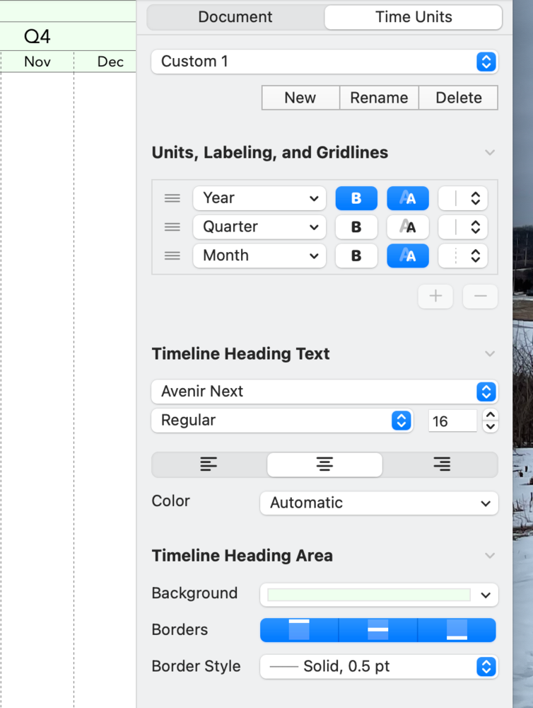
Another big thing I’ve been working on for TimeStory 3.0 is a the timeline header which runs across your timelines. It’s now much more configurable, with support for adjusting text alignment, background color, borders, and more.

The vertical grid has been reworked too; instead of a single on/off switch with two styles, you can now assign different vertical grid styles to each row in the timeline header, as you can see above with the month, quarter, and year divider lines.
Since version 1, TimeStory has supported very flexible scaling of your timelines, with the timeline header automatically adapting. In version 3, I gave that code a lot of attention, making it smarter, and solving one annoyance: when a row in the header gets too compressed to be useful, it now just disappears.
TimeStory still comes with the same five configurations as before (year, quarter, month, week, and day), but you can now create custom configurations and add, remove, alter, or re-order rows.
I had previously blogged about a major rework to the Inspector’s internal design, and alluded to the new features which motivated them. This is what I was thinking of. There are more options, and they are more interrelated, and the old code couldn’t support them with any sort of usability.

I’ve been using these changes on my own timelines for a while now, and I’m really happy with the improvements. I look forward to getting 3.0 into people’s hands. (And, of course, this isn’t the end of the 3.0 changes… my blogging is well behind my coding!)