-
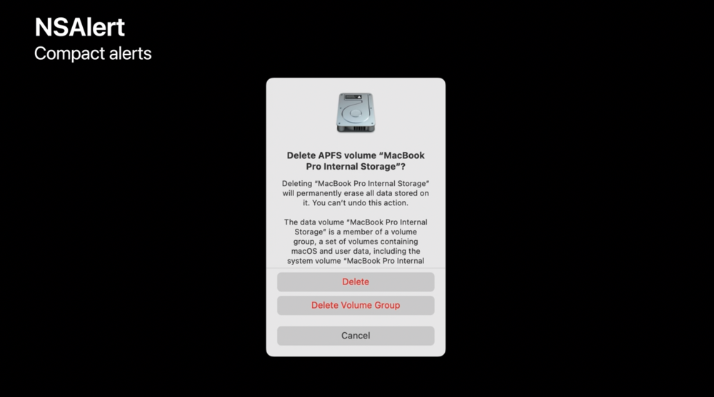
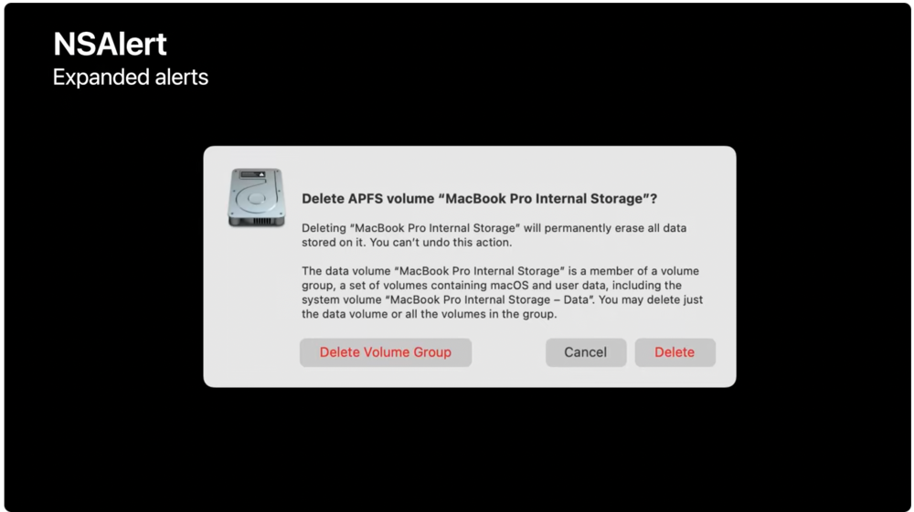
I stand partially corrected. I’d hoped that macOS alerts would switch back from the compact, vertically oriented, centered-text style of Big Sur to the left-aligned, horizontally oriented style from before. After the initial Ventura overview, I thought I was out of luck. But it turns out that there are new heuristics in AppKit which do switch back to the old style if given long text content or accessory views. This solves the worst-looking and most-unusable cases, so I welcome it, but I’d still much rather have a single, consistent alert style, designed for the Mac rather than for the iPhone.
Screenshots from the WWDC AppKit session - The new collaboration and sharing support looks great so far. Lots more sessions to watch.
- Mac devs don’t need to do much to support Stage Manager, but things like floating panels and preferences panes may need window-style adjustments. (I still don’t think I like it.)
- I don’t love the renaming of Preferences to Settings. I’ll need to check Help and other things for inconsistencies.
- The updates to NSColorWell caught my eye. I think that most Mac productivity apps already implemented their own color wells with this kind of quick popover-based behavior and modernized look; I did, for example.
Finally, it’s notable that there’s a whole section in What’s New in AppKit which isn’t really about AppKit at all. There’s a whole new control style for heavy forms like inspectors, and the advice on how to enable it is to use SwiftUI. Welp, nobody can complain any more that Apple is ambiguous about framework strategy.

